KRANJ
7. 2016Destination branding: visual identity
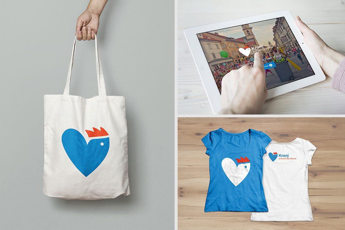
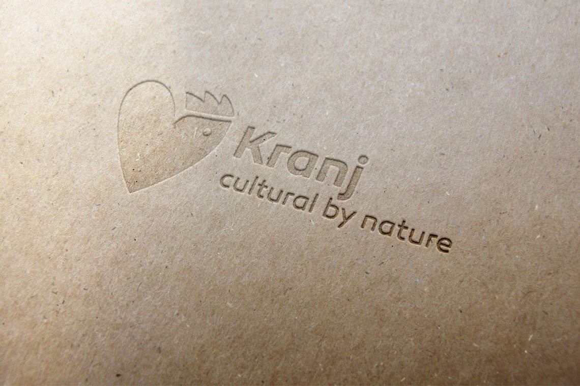
The logo design proposal for the visual identity of the Kranj tourist destination consists of a symbol and the position statement “Cultural by nature” which has been already proposed in the given brief. The symbol emerges from the synthesis of an abstracted image of the heart and a rooster. The symbolism of the rooster representing the power of life, bravery, honesty and pride has been already set out in the ancient mythology. Thus the important role of a rooster as an animal with is red crown illustrates the position of the city Kranj as the capital of the Gorenjska region. Moreover, the rooster figure can be found at the top of the stone fountain in the Kranj old city centre – it is the work of the Slovenian greatest architect Jože Plečnik. As in the past, the rooster remains an important part of every farm and, thus, illustrates the following virtues of the city of Kranj: timelessness, comfort, and familiarity. By its singing: its “cultural behaviour by nature” the rooster emphasises the cultural richness of Kranj and thus establishes a direct relation with the position statement.
The modern shape of the rooster manages to indistinguishably blend with the shape of a heart which enhances the vitality and strength of this proud animal. The blue colour represents water – the beginning of each life and civilization. The city of Kranj is located at the confluence of two rivers, Sava and Kokra. The two rivers, each on its’ side of the city, represent the two halves of the heart. The blue rooster, therefore, combines two of Kranj’ greatest values: cultural and natural heritage. Combined with the slogan, they form a unique and integral unity.
Forming the logo, the primary colours of the visual identity of the Kranj tourist destination were warm bright red and calm light blue. These two colours are directly linked with the heritage of the city of Kranj since its coat-of-arms once consisted of an image of a red eagle on a blue background. Next to that, the red colour of the rooster’s crown represents the colour of the clay-tiled rooftops, while the blue colour of the heart represents the colour of the two rivers that surround the city centre. In addition to the two primary colours, the logo comes in a combination of white and red.