triteraj
4. 20161st prize at the Freešn competition (student competition of creative communication)
Graphic designer: Ana Kompara
Copywriter: Ana Kompara
Creating a new luxury brand of Slovenian wines, the aim was to promote tradition by giving it a fresh new flair. The brand name was supposed to reflect Slovenian winemaking story and the unique market position of Slovenian wines. Our target group were Slovenians as well as foreigners that appreciate Slovenian wine-growing potential.
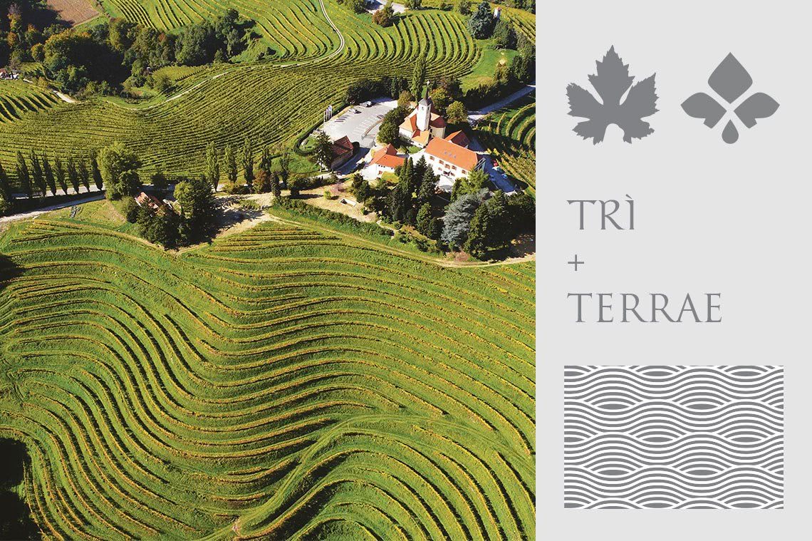
The name of the created brand, Triteraj, reflects the unique story of our country with three wine regions on a relatively small territory. Thus, the name originates from the word phrase “three regions” or “three lands” emphasising the importance of fertile soil and its cultivation. However, while boasting about Slovenian winemaking tradition, we should recognize the important role of Celts and Romans who introduced and fostered the winemaking culture on Slovenian territory. Therefore, the brand name is composed of two words – one of Celtic and the other of Latin origin. The first word “tri” (number three in English) is of Celtic origin and has completely preserved its form in Slovenian. The second word “teraj” is a Slovenian phonetic adaptation of the Latin word “terra” or in plural “terrae” (meaning the land in Latin). Thus, the name Triteraj not only reflects Slovenian unique winemaking story across the three wine regions but also praises its origin.

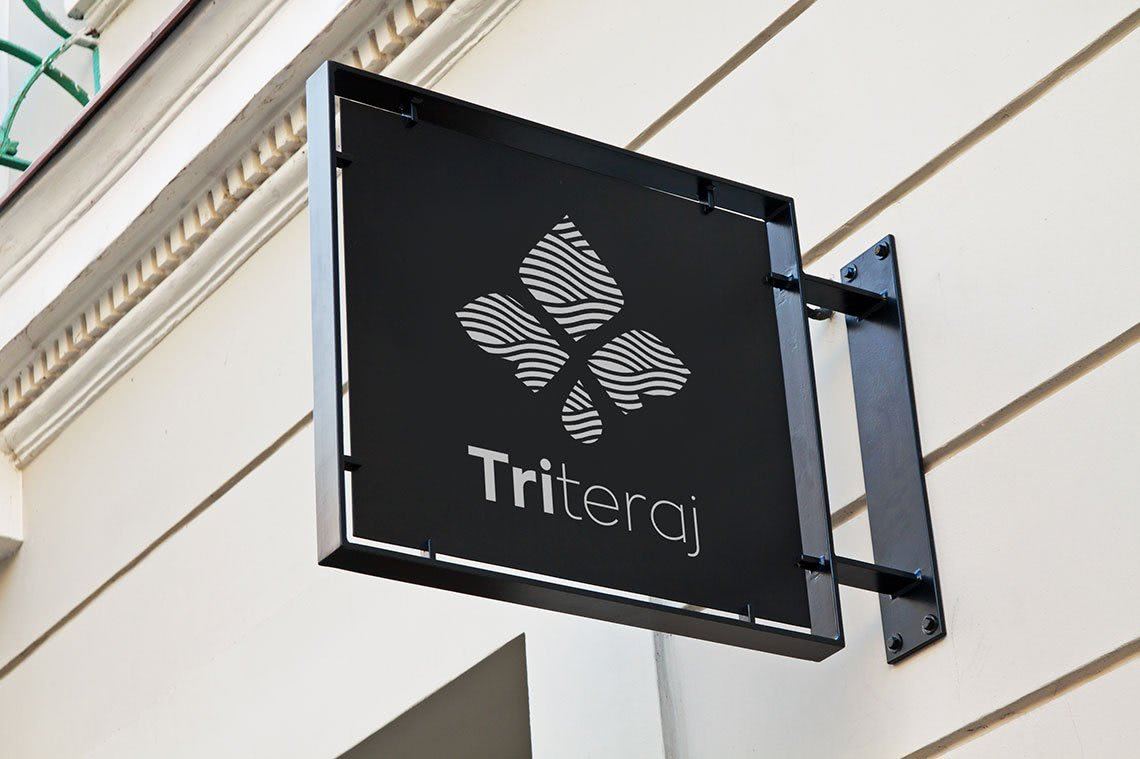
The visual identity of the brand is based on a symbol in the shape of a vine leaf and a wine drop to stress the direct connection between a plant and wine as well as symbolic significance of the trademark which unites and presents wines from the three wine regions (three regions: three leaves). The logo’s pattern reflects the character of Slovenian wine regions: the sea waves of the Primorska region and the rolling vineyard terraces in the Podravska and the Posavje region. To gain brand’s recognition and identification with the country of origin, the symbol is accompanied by the name of the brand, Triteraj, followed by the country of origin – Slovenia. When used as a bottle label, country’s name can be replaced with the wine sort (Sauvignon, Refosco, Malvasia).
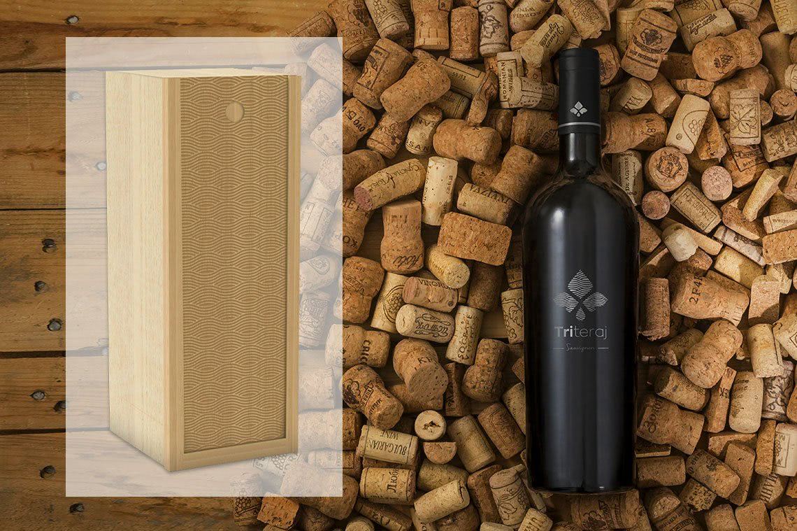
The appearance of the bottle reflects the synthesis of simple elegance and freshness. A simple shape and the dark colour of the wrap with a light grey, slightly silver Triteraj logo create a sense of prestigious and sophisticated content.
The brand logo on the front of the bottle is made with a method of transparent film or so called clear labelling. Bottles can be packed in a wooden case with a sliding lid decorated with the distinctive Triteraj pattern. The case is made of local beech wood.